

Let's talk.
I'll buy you a coffee.
I'll buy you a coffee.
davalos.uiux@gmail.com


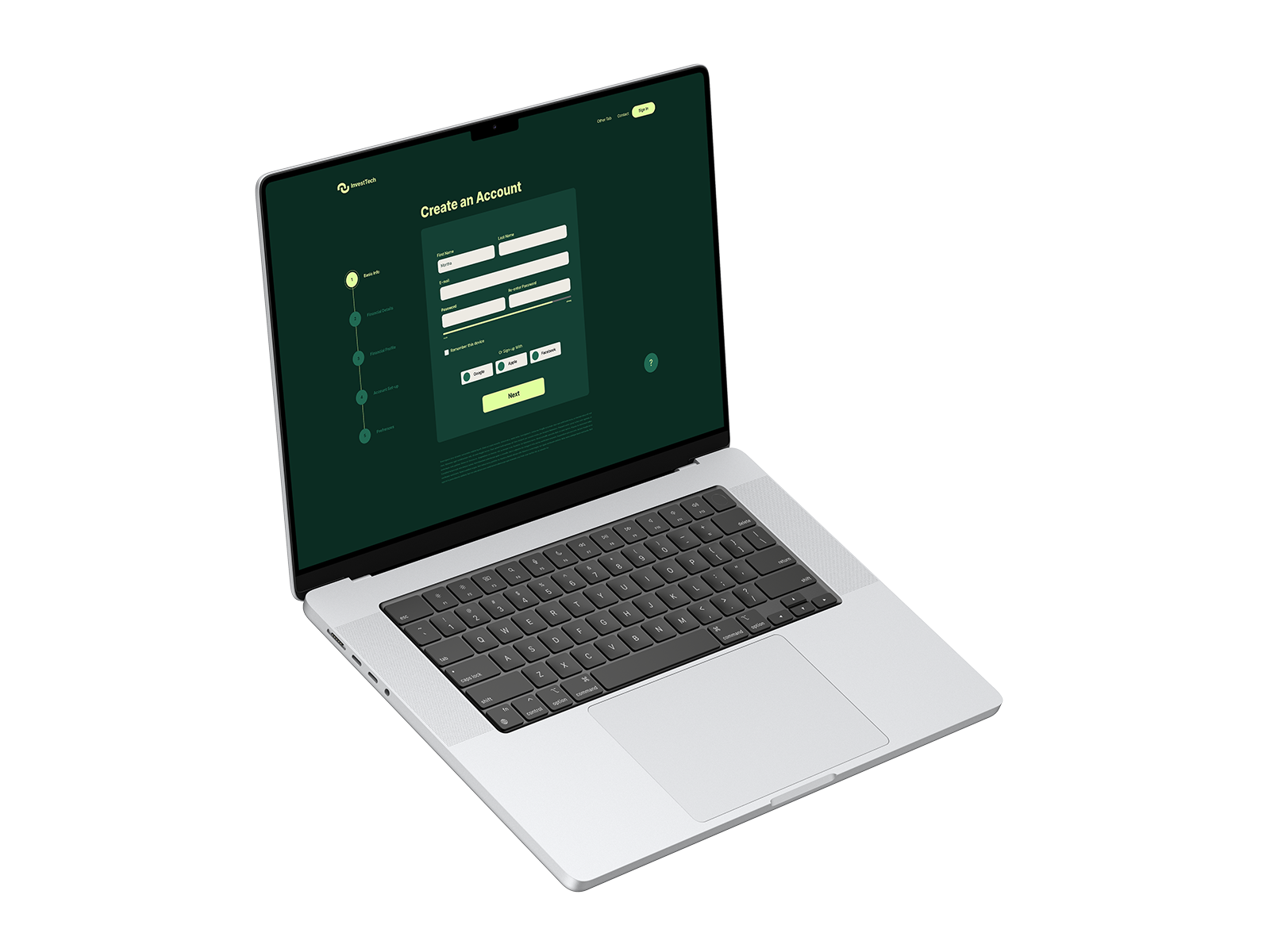
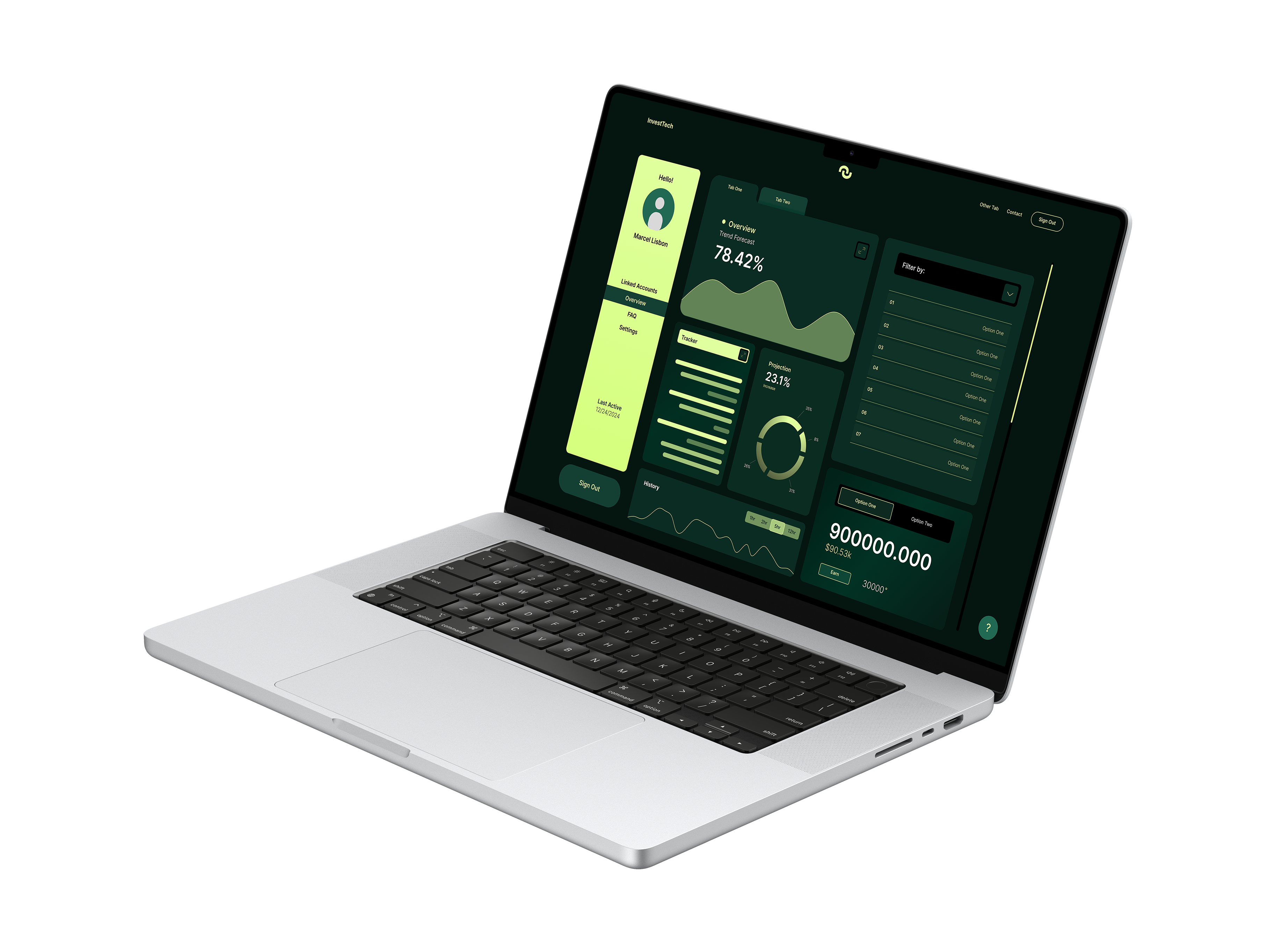
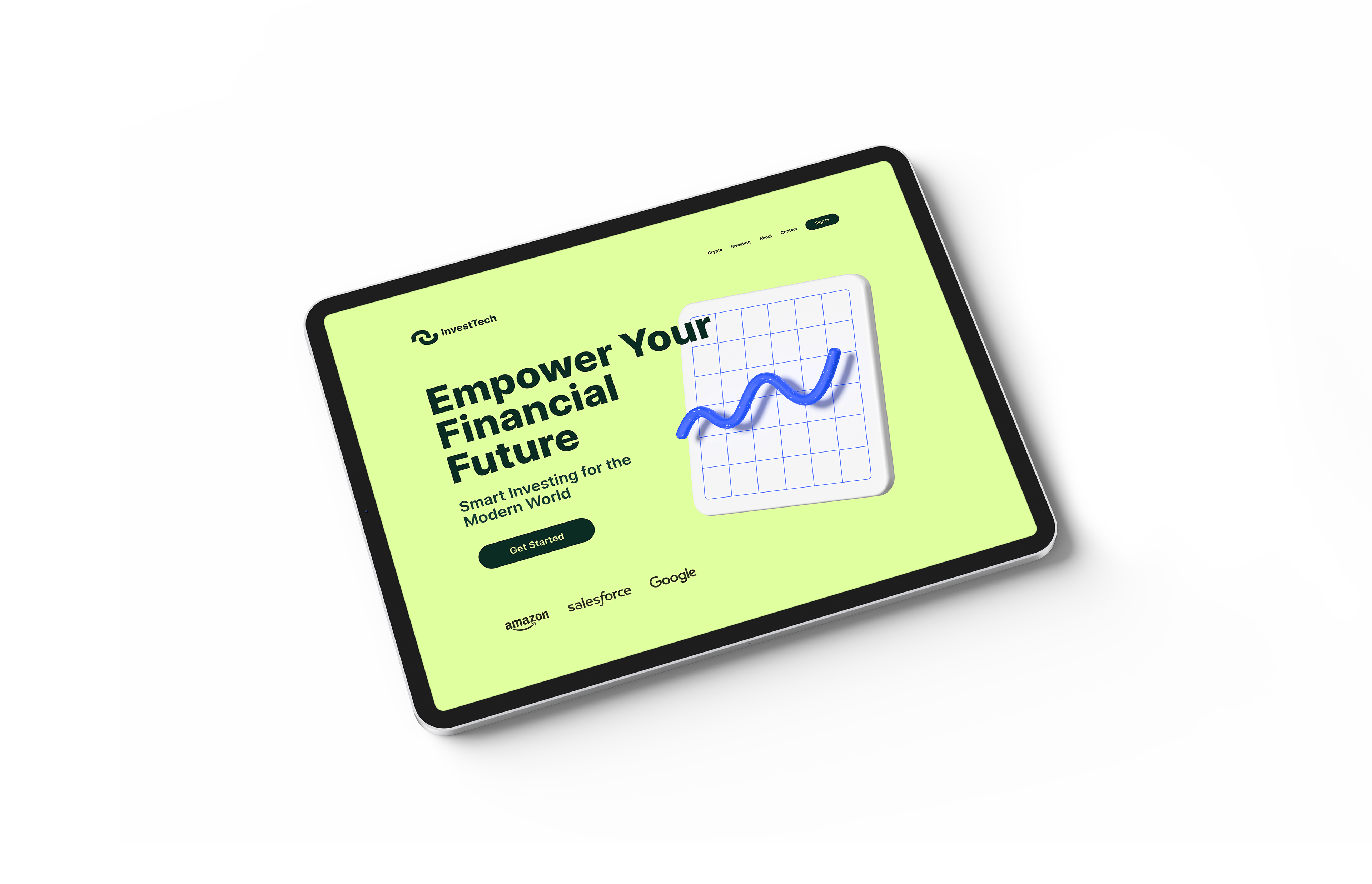
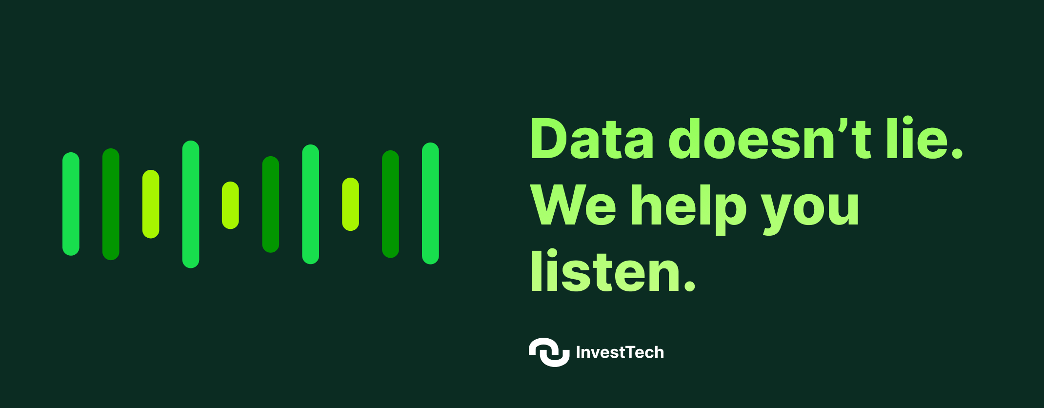
Most investment platforms treat financial data like a spreadsheet with ambitions, overwhelming users with numbers before they understand what any of it means. This concept project explores what it looks like when a dashboard is designed around human decision-making first. I built the full visual identity and product experience from scratch, prioritizing clear data hierarchy, progressive disclosure of complex information, and interaction patterns that guide rather than overwhelm. The brand deliberately breaks from the conservative visual language of traditional finance — high contrast, kinetic, and confident — because trust in a financial product is earned through clarity, not formality. Every screen was designed around a single question: does this help someone make a better decision about their money. The answer had to be yes before anything shipped.